Optional configuration for PayLater Checkout
Optional button configuration
You can provide optional configuration to the button, including using custom class or id on the PayLater button container, changing the height of the button, turning off the 'as low as' promotional messaging below the button, and overriding the text content.
| Param | Type | Description | Default Value |
|---|---|---|---|
| container | string | Class name or id of the container div | 'lendica-paylater-container' |
| height | number | Height of the button | 36 |
| showAsLowAs | boolean | Flag to turn on and off promotional messaging below the button. The messaging may change based on the latest campaign Lendica is running. | true |
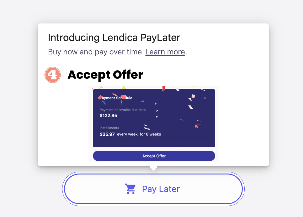
| children | string | Button text | 'Checkout & PayLater' |
Example usage:
<!-- Button width is default to 100% of the parent container.
	Add styles to the container class to control the width -->
<style>
  .lendica-paylater-container {
    width: 280px; /* use 'fit-content' to have minimun width around the content */
  }
</style>

<div class="lendica-paylater-container"></div>
// When rendering the button, you can pass optional configs
lendica.paylater.renderButton({
	container: "custom-container-class-or-id",  // overwrites default container class "lendica-paylater-container"
	height: 44,  // number, note: width will always be 100% of parent. Add styles to the container class to control the width
	showAsLowAs: false,
	children: 'Pay Later'
});